7. Materia
We know that a lot of folk love Materia so we couldn’t omit this style from our roundup. We think it’s slightly overrated but maybe we are wrong.
8. Ant-Dark
As the name suggest, Ant-Dark is a dark theme. It’s modern in appearance. The theme won’t give your desktop an overtly lively and colourful look. But this might be exactly what you want.
9. GruvBoxPlasma
This is a suite of themes for KDE applications that match the retro gruvbox colorscheme for Vim, a highly configurable text editor built to make creating and changing any kind of text very efficient.
GruvBoxPlasma is published under the MIT license.
10. Monochrome KDE
Monochrome is one of the most striking themes. This dark theme is inspired by black and white photography.
The theme consists of the following components: Aurorae Theme, Konsole Colour Scheme, Kvantum Theme, Plasma Colour Scheme, Plasma Desktop Theme, Plasma Look and Feel, Plasma Splash Screen, SDDM Theme, and a Yakuake Skin.
The theme is licensed under the GNU General Public License v3.0
11. Psion
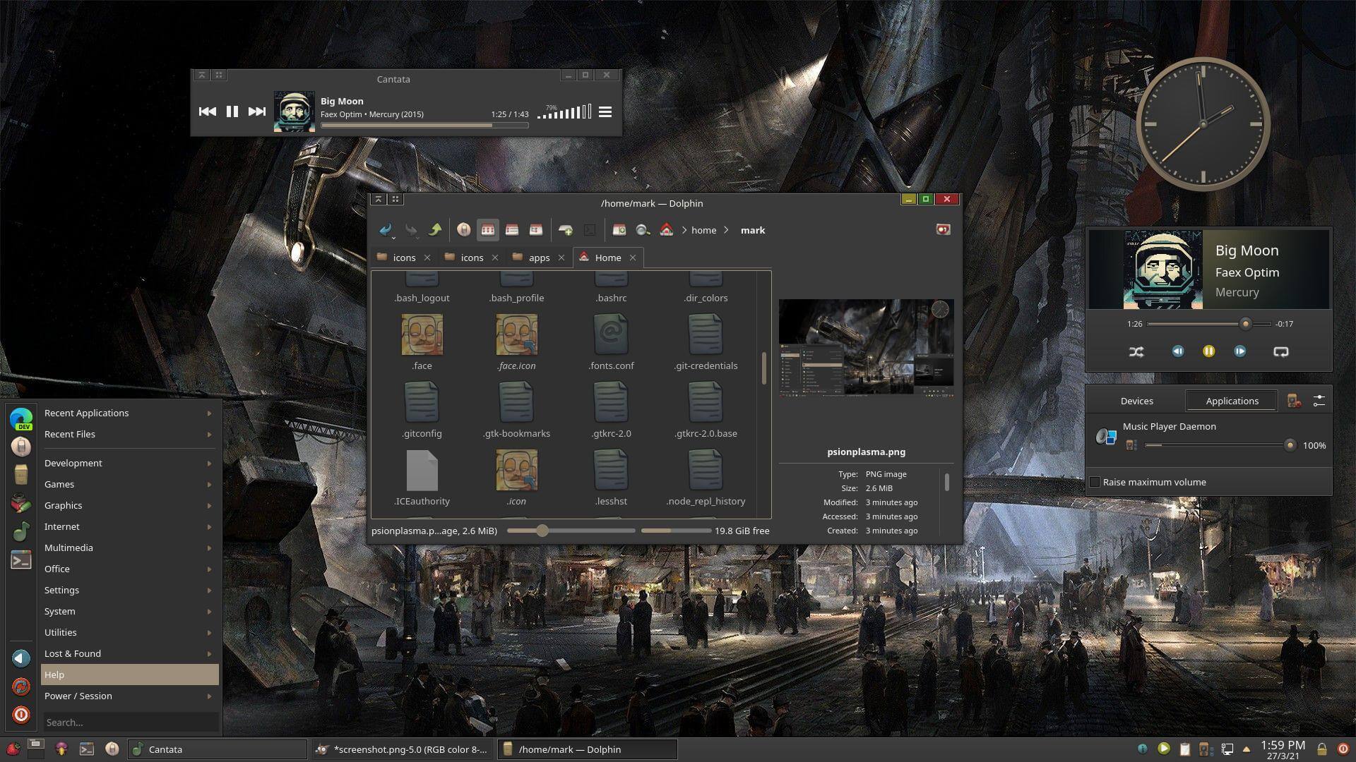
Psion offers a bold industrial look and provides themes for Plasma, Aurorae and Colorschemes.
12. Aritim
There are light and dark themes available. We’re showing the light theme here.
Pages in this article:
Page 1 – Introduction / Awesome Themes
Page 2 – More Awesome Themes
Page 3 – Yet more…
Page 4 – Mimic other operating systems
Mondrian is definitely the most striking theme I’ve seen
I loved IRIX with 4Dwm window manager. It was based on the classic Motif window manager. That reminds me, I must try Motif again, it was open sourced eventually.
Live for the moment, not the past.
Dracula looks cool
it’s my favorite
None of them have a transparent kicker. Also too much darkness. I just build my own from 3 to 4 other styles. If you are in the know it is easy. Inkscape can be your friend. If you want some color, dig up the old oxygen kicker icon set. The current rage of dark and no color is hard on old eyes.
Dark themes are kinder on older eyes.
Some of the dark themes here have light versions too.
Not for my older eyes (66). Dark makes it hard for me to read. Redshift is what I need.
There is useful eye care software here.
I concur with James, for older eyes (68) dark is not a good choice. I certainly understand younger eyes enjoying the contrast and lower brightness. I’m pretty happy with the ChromeOS Light theme but use either Breeze Extra Icons or Breeze Rounded Icons along with Breeze window decorations. Frankly I have not seen a window decoration I would change Breeze for, they baked that cake just right!
My sentiments exactly