13. Prof Dark
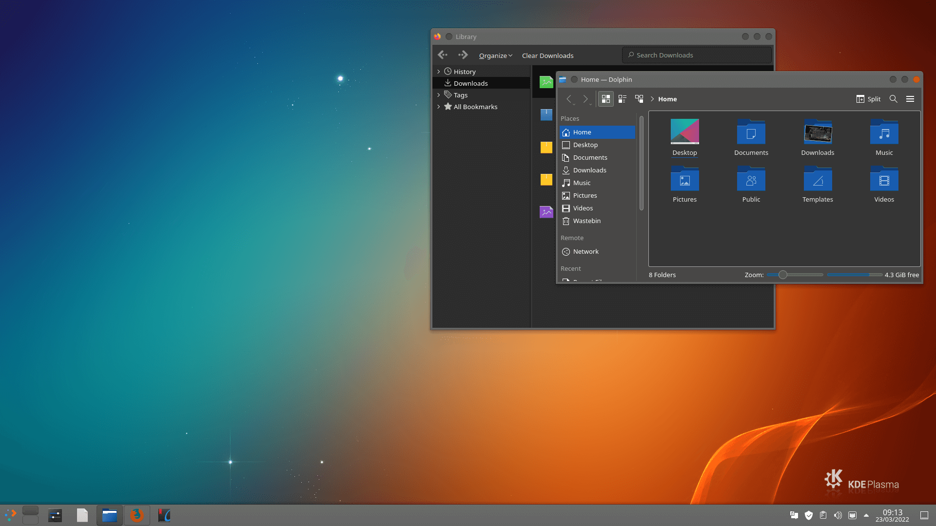
In many eyes, Prof Dark offers a sleek and uniform desktop experience. We prefer the dark version.
This theme is published under the GNU General Public License v3.0.
14. Cherry
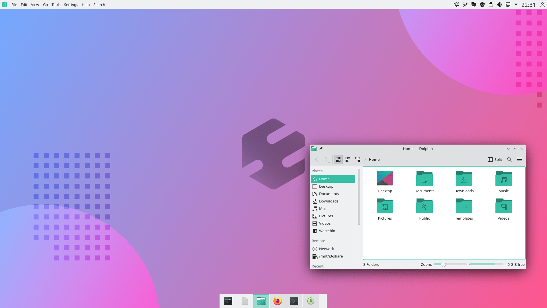
Cherry Global is another amazing theme. It draws inspiration from the Honkai Impact 3 game, the spiritual successor to Houkai Gakuen 2, using many characters from the previous title in a separate story.
This theme consist of several components including: aurorae themes (regular, solid, square, square-solid), konsole and kitty colorscheme, kvantum theme (regular, solid), plasma colorscheme, plasma desktop theme, and a splash screen
The theme is based on Layan and licensed under the GNU General Public License v3.0.
15. Sweet Mars KDE
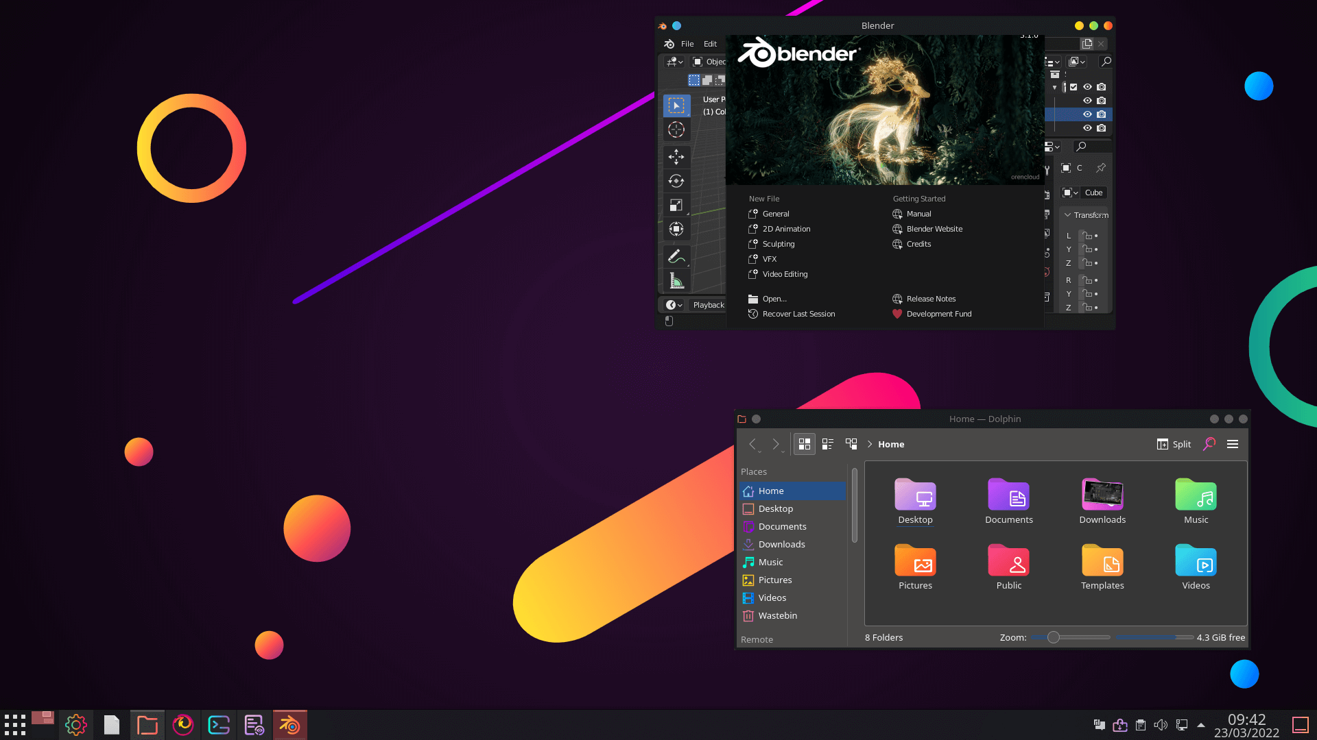
Sweet Mars KDE is a dark and modern theme that’s superbly vibrant. It ships some of the most sublime icons you’ll ever see.
It’s published under the GNU General Public License v3.0.
16. Dracula
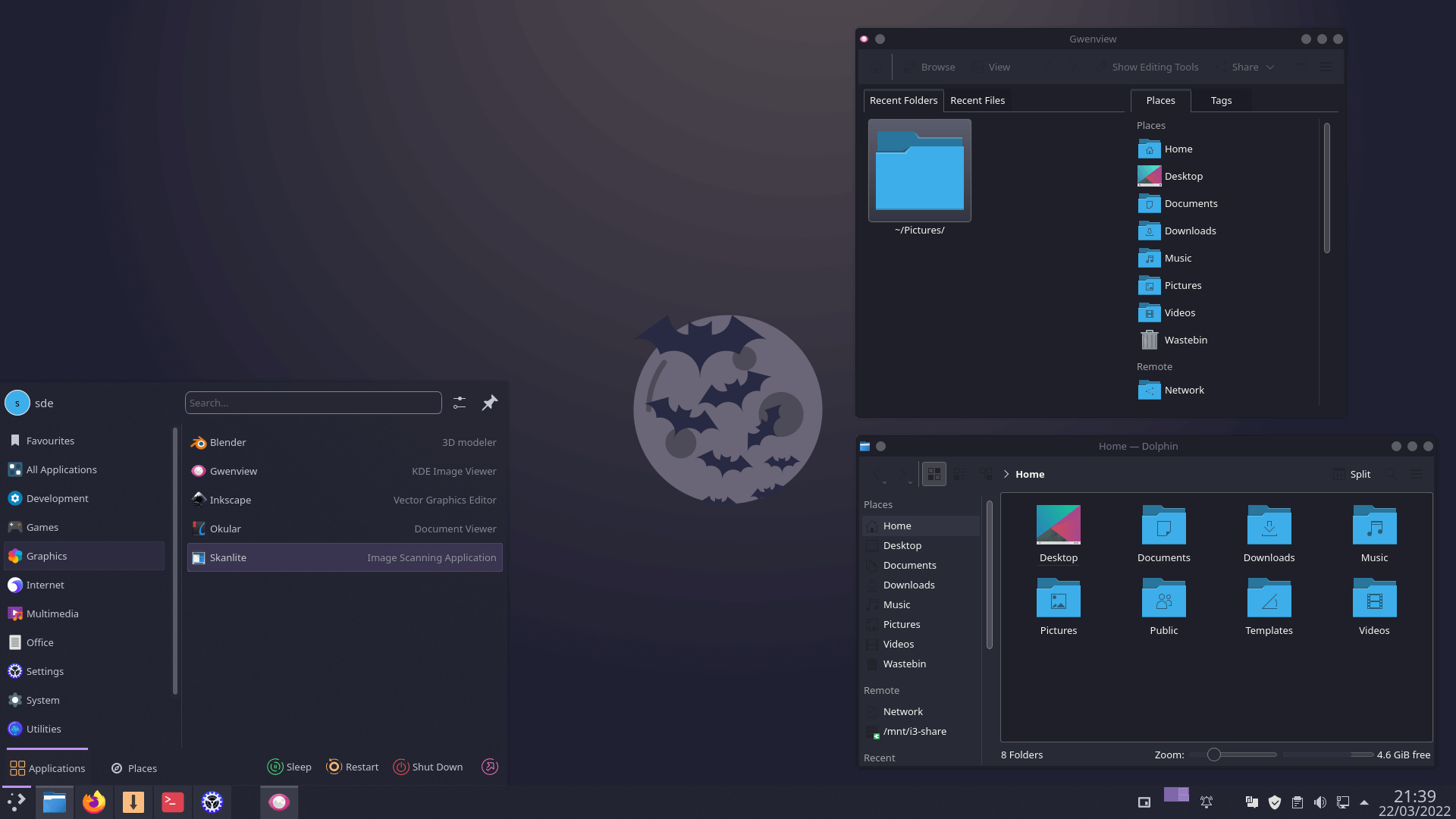
Dracula is a dark theme using the Dracula colour palette. Besides KDE, it’s a dark theme for more than 250 different apps.
Arguably Dracula should be rated much higher. We love it!
17. KShell
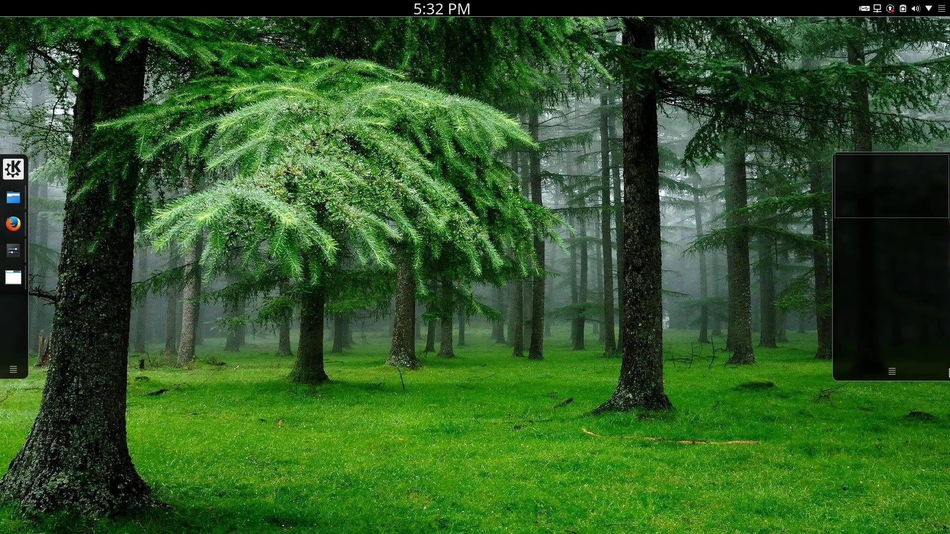
Do you hanker after the appearance of the GNOME Shell but in all other respects you’re committed to KDE? Maybe KShell might be your Plasma theme as it seeks inspiration from GNOME Shell.
18. Numix
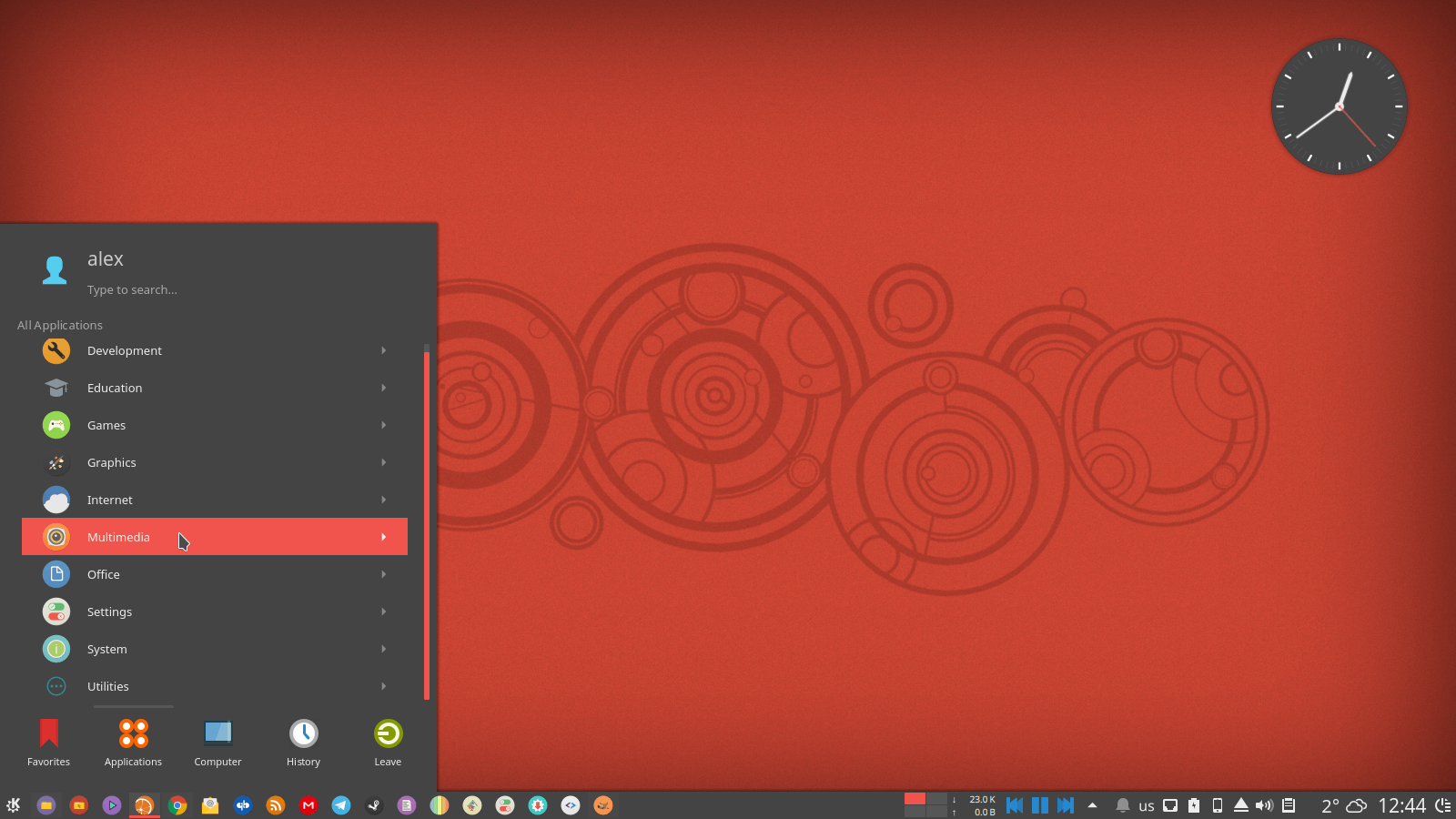
Numix is another quality Plasma theme featuring a flat, dark and sleek design.
Next page: Page 4 – Mimic other operating systems
Pages in this article:
Page 1 – Introduction / Awesome Themes
Page 2 – More Awesome Themes
Page 3 – Yet more…
Page 4 – Mimic other operating systems


Mondrian is definitely the most striking theme I’ve seen
I loved IRIX with 4Dwm window manager. It was based on the classic Motif window manager. That reminds me, I must try Motif again, it was open sourced eventually.
Live for the moment, not the past.
Dracula looks cool
it’s my favorite
None of them have a transparent kicker. Also too much darkness. I just build my own from 3 to 4 other styles. If you are in the know it is easy. Inkscape can be your friend. If you want some color, dig up the old oxygen kicker icon set. The current rage of dark and no color is hard on old eyes.
Dark themes are kinder on older eyes.
Some of the dark themes here have light versions too.
Not for my older eyes (66). Dark makes it hard for me to read. Redshift is what I need.
There is useful eye care software here.
I concur with James, for older eyes (68) dark is not a good choice. I certainly understand younger eyes enjoying the contrast and lower brightness. I’m pretty happy with the ChromeOS Light theme but use either Breeze Extra Icons or Breeze Rounded Icons along with Breeze window decorations. Frankly I have not seen a window decoration I would change Breeze for, they baked that cake just right!
My sentiments exactly