19. Irixium
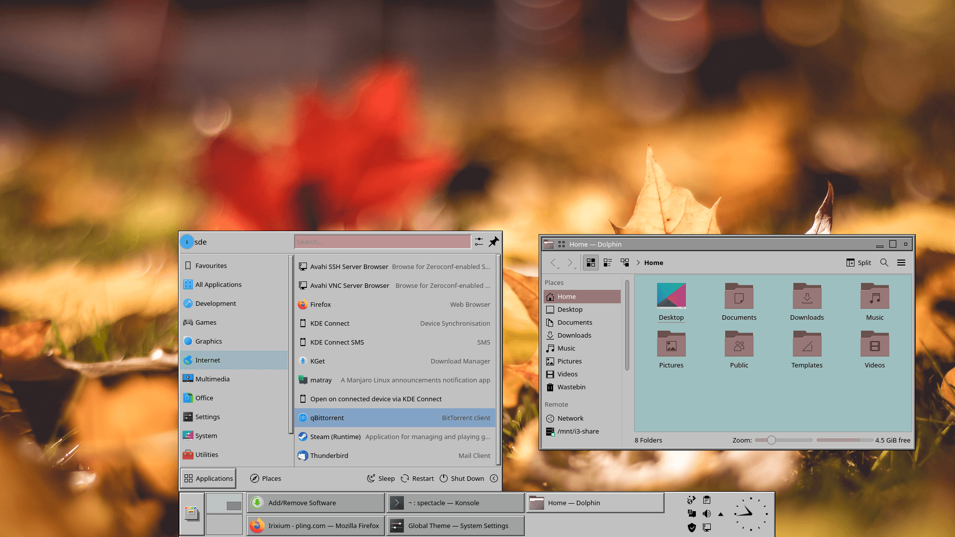
Irixium brings the appearance of IRIX to the Plasma desktop. By modern standards it feels positively clunky. But if you hanker after the good old days, maybe it’s up your street.
In case you didn’t know, IRIX is a discontinued operating system developed by Silicon Graphics (SGI) to run on the company’s proprietary MIPS workstations and servers.
20. ChromeOS kde
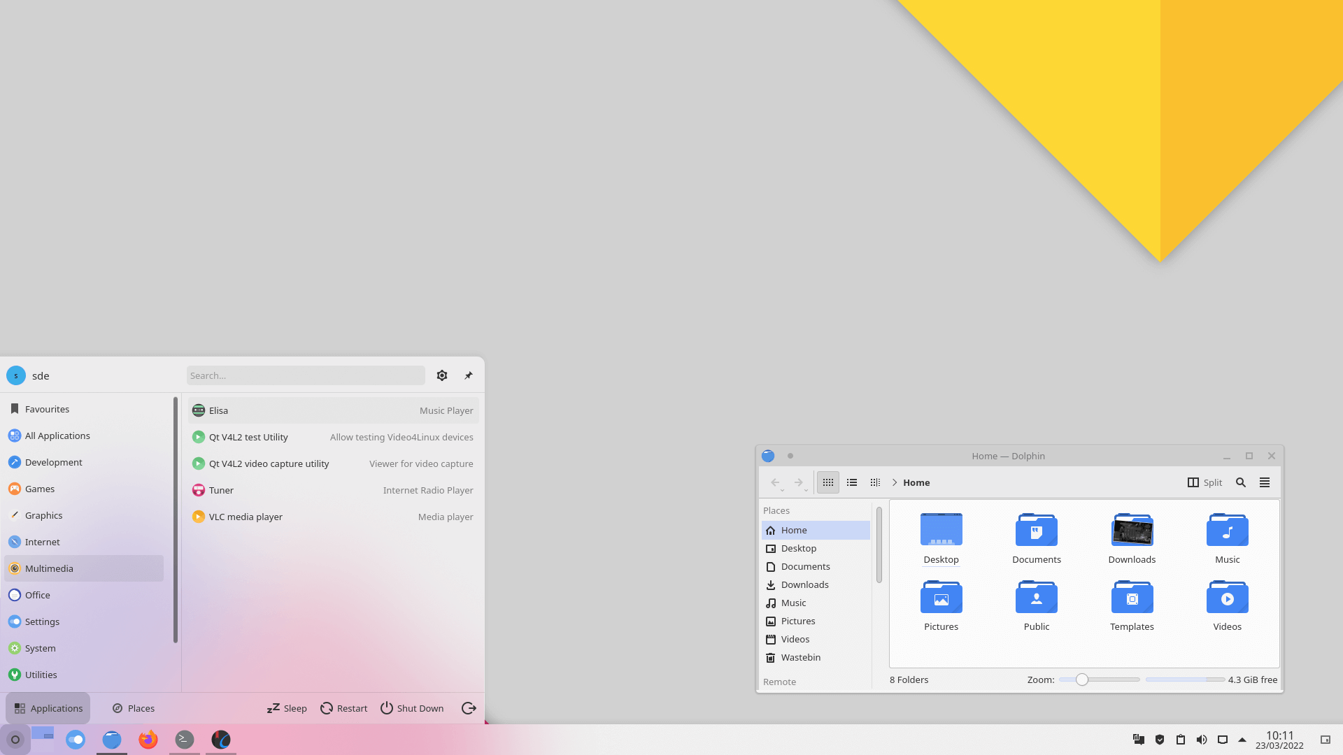
ChromeOS kde is a material Design theme for KDE Plasma desktop. The image shows the light variant.
This theme is published under the GNU General Public License version 3.
21. WhiteSur Dark
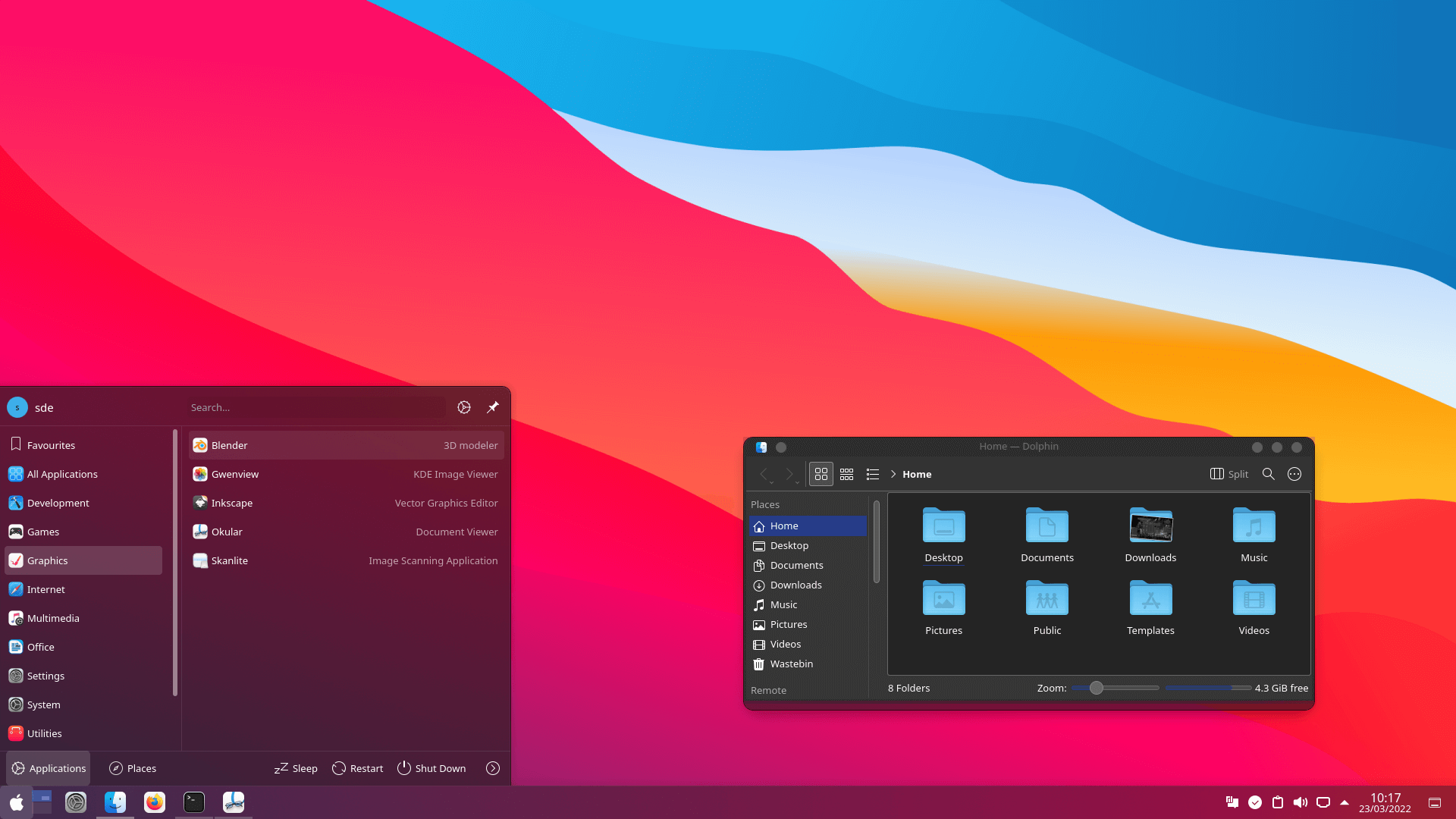
This is another macOS like theme for Plasma. In our opinion it has the edge on McMojavae.
22. McMojavae Plasma
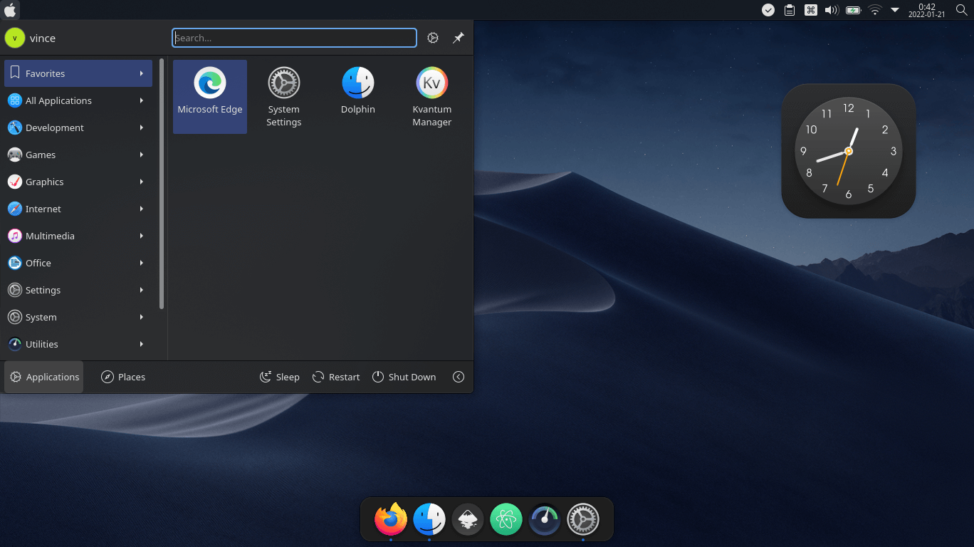
McMojave KDE is a Mac OS X Mojave like theme for Plasma. We are big fans of this theme but that Apple icon might just be a step too far for some Linux users.
23. W11OS
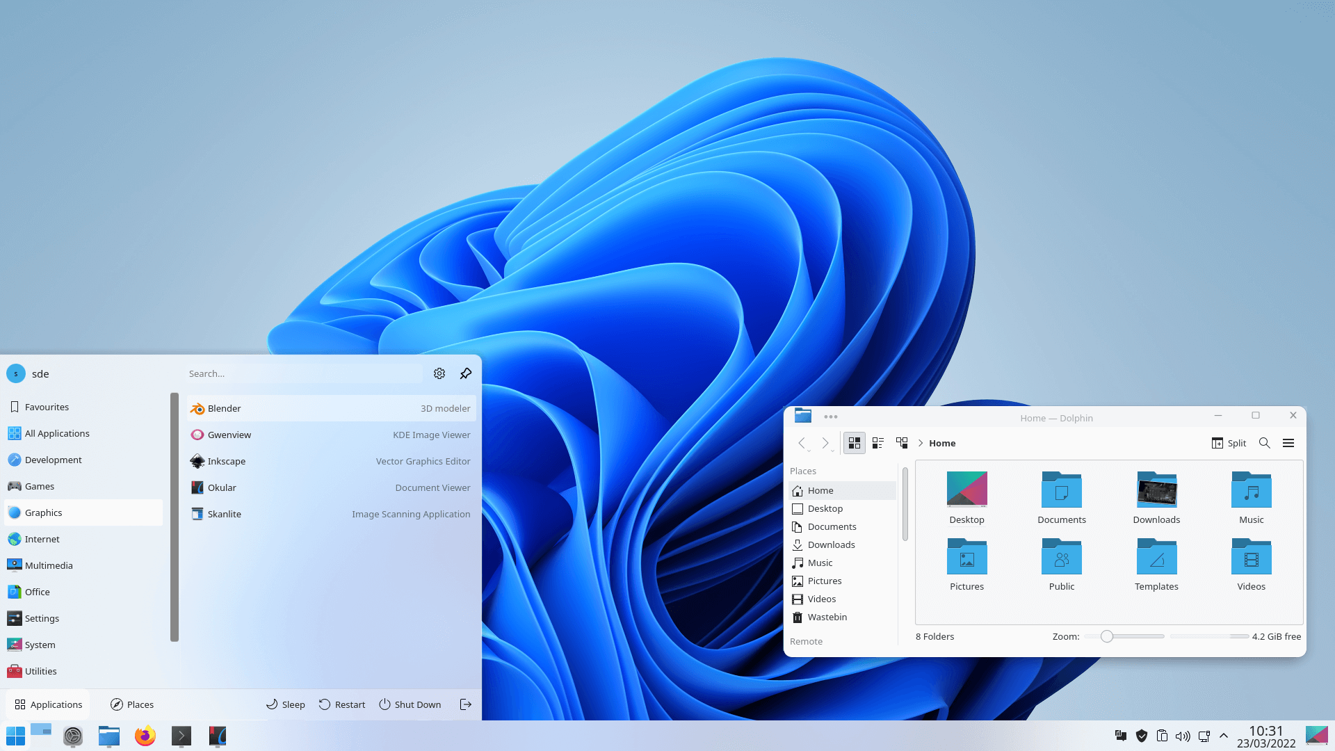
Do you really want your beautfiul and elegant KDE desktop to have the appearance of Windows 11?
Here’s the light version. We are definitely not going to use this theme as our default. Ever! But maybe you want to play a prank on a friend?
24. We10XOS
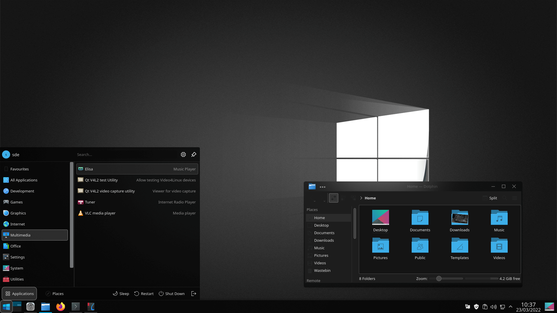
We’re showing the dark theme. We’ve put this theme last. There’s a reason why, but we’re not telling 🙂
There are many other KDE themes available, and we’re bound to have missed some people’s favourites. This might be because we have different tastes, or that the theme hasn’t yet made it to the current release of KDE. Notable examples include Helium and Nilium.
Pages in this article:
Page 1 – Introduction / Awesome Themes
Page 2 – More Awesome Themes
Page 3 – Yet more…
Page 4 – Mimic other operating systems

Mondrian is definitely the most striking theme I’ve seen
I loved IRIX with 4Dwm window manager. It was based on the classic Motif window manager. That reminds me, I must try Motif again, it was open sourced eventually.
Live for the moment, not the past.
Dracula looks cool
None of them have a transparent kicker. Also too much darkness. I just build my own from 3 to 4 other styles. If you are in the know it is easy. Inkscape can be your friend. If you want some color, dig up the old oxygen kicker icon set. The current rage of dark and no color is hard on old eyes.
Dark themes are kinder on older eyes.
Some of the dark themes here have light versions too.
Not for my older eyes (66). Dark makes it hard for me to read. Redshift is what I need.
There is useful eye care software here.
I concur with James, for older eyes (68) dark is not a good choice. I certainly understand younger eyes enjoying the contrast and lower brightness. I’m pretty happy with the ChromeOS Light theme but use either Breeze Extra Icons or Breeze Rounded Icons along with Breeze window decorations. Frankly I have not seen a window decoration I would change Breeze for, they baked that cake just right!
My sentiments exactly